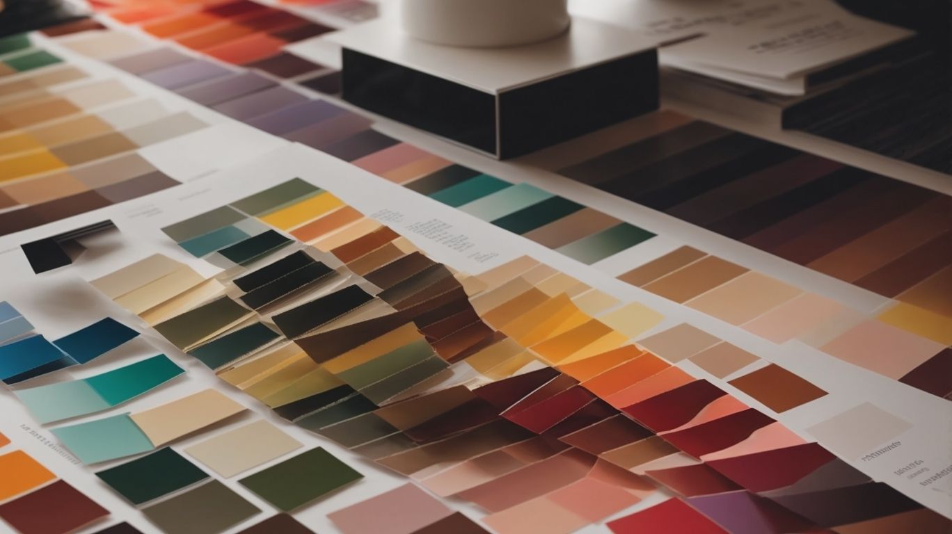
Color psychology plays a crucial role in graphic design, influencing everything from branding and logo design to website and packaging design. Understanding the associations and meanings of different colors is essential for designers to create effective and impactful visuals.
In this comprehensive overview, we will explore the influence of color psychology on graphic design, the meanings behind different colors, and how designers can use this knowledge to their advantage.
We will also delve into common color mistakes to avoid in graphic design. Join us as we unveil the fascinating world of color psychology in graphic design.
Contents
- 1 Key Takeaways:
- 2 What Is Color Psychology?
- 3 How Does Color Psychology Influence Graphic Design?
- 4 What Are The Different Colors And Their Meanings?
- 5 How Can Graphic Designers Use Color Psychology?
- 6 What Are Some Common Color Mistakes in Graphic Design?
- 7 Frequently Asked Questions
- 7.1 What is color psychology and how does it relate to graphic design?
- 7.2 How important is color in graphic design?
- 7.3 How does color impact consumer behavior in graphic design?
- 7.4 What are some common color associations in graphic design?
- 7.5 How can graphic designers use color psychology to create effective branding?
- 7.6 Are there any guidelines for using color in graphic design?
Key Takeaways:
- Color psychology plays a crucial role in graphic design, influencing emotions, behaviors, and perceptions of a design.
- It’s important for graphic designers to understand the meanings and associations behind each color in order to effectively use them in their designs.
- Avoiding common color mistakes, such as using too many colors or ignoring cultural associations, can greatly enhance the impact of a design.
What Is Color Psychology?
Color psychology explores the impact of colors on human behavior, emotions, and decision-making processes, particularly in the realms of branding, marketing, and design.
Colors play a crucial role in creating an emotional connection with consumers, shaping their perceptions, and influencing their purchasing decisions.
For instance, red is known to evoke feelings of excitement and urgency, often used by brands to grab attention and create a sense of urgency in their marketing campaigns.
In contrast, blue is associated with trust, reliability, and tranquility, making it a popular choice for financial institutions and healthcare brands.
Understanding the psychological impact of colors allows marketers and designers to strategically align their use of colors with their desired brand image and message, ultimately influencing consumer behavior.
How Does Color Psychology Influence Graphic Design?
Color psychology significantly influences graphic design by shaping visual communication through the strategic use of color associations, contrast, harmony, and the application of color theory and trends.
Color Associations
Color associations in graphic design leverage the principles of color psychology to evoke specific emotions, represent cultural significance, and influence consumer behavior through visual stimuli.
For example, in Western cultures, the color red is often associated with passion, love, and energy, whereas in Eastern cultures, it symbolizes good fortune and joy. Similarly, blue exudes feelings of calm, trust, and stability in many cultures, while in some Eastern cultures, it signifies immortality.
Green is universally linked to nature and growth, but in some cultures, it holds financial connotations. Understanding these nuances is crucial for designers to elicit the desired response from their target audience.
Color Contrast
Color contrast plays a pivotal role in graphic design, employing the principles of color psychology to create visual impact and enhance legibility through the strategic arrangement of colors on the color wheel.
By effectively utilizing color contrast, designers can establish visual hierarchy within their compositions, guiding the viewers’ attention and emphasizing key elements.
For instance, the use of a bold, contrasting color for a call-to-action button against a neutral background can significantly enhance its visibility and encourage user interaction.
In terms of readability, carefully selected color contrasts can improve content accessibility, ensuring that information is easily comprehensible to a wider audience.
Color Combinations
Color combinations in graphic design draw from color psychology principles to achieve visual harmony, balance, and aesthetic appeal, particularly in the context of web design where user experience is paramount.
When choosing color combinations for graphic design, designers consider the emotional and psychological impact of colors on the viewer. They take into account how different colors evoke specific feelings and how they can influence a user’s perception and behavior.
For example, warm colors like red and orange can create a sense of energy and excitement, while cool colors like blue and green are often associated with calmness and tranquility. Color combinations play a crucial role in establishing hierarchy and guiding the user’s attention.
By using contrasting colors for important elements and complementary colors for related content, designers can create a visually appealing layout that enhances readability and navigation.
Color Hierarchy
Color hierarchy in graphic design leverages color psychology to establish visual prominence, convey brand identity, and guide user attention through the strategic application of colors in design and branding elements.
Color hierarchy signifies the deliberate arrangement of colors within a design to create a visual hierarchy that draws attention and communicates information effectively.
It involves the careful selection of a dominant color that represents the brand essence, supported by secondary and accent colors that complement and enhance the overall visual impact.
An effective example of color hierarchy is seen in the branding of Coca-Cola, where the vibrant red color serves as the dominant hue, instantly evoking the brand’s identity and creating strong brand recognition.
This strategic use of color ensures that the brand stands out amidst its competitors and establishes a lasting visual impact on consumers.
What Are The Different Colors And Their Meanings?
Understanding the meanings associated with different colors is essential in leveraging color psychology for effective communication and visual representation. Each color carries unique significance and evokes distinct emotions and perceptions.
For instance, the color red often symbolizes passion, energy, and excitement, making it a popular choice for products that aim to evoke strong emotions, such as in the food and beverage industry.
On the other hand, blue is associated with tranquility, trust, and professionalism, often used by financial institutions and tech companies to convey reliability and stability.
Additionally, yellow is often linked to optimism, happiness, and youthfulness, frequently used by brands targeting a younger demographic.
Red
The color red is often associated with emotions such as passion, energy, and intensity, making it a powerful and attention-grabbing hue in graphic design and branding.
Psychologically, red is known to stimulate and activate the senses, eliciting strong emotional responses. It has been found to increase heart rate and create a sense of urgency, making it an effective tool for capturing attention.
In consumer behavior, red is often used to signify power, excitement, and urgency, which can influence purchasing decisions and drive impulse buying. The bold and striking nature of red makes it a popular choice for brand identity, where it can evoke strong visual impact and instant brand recognition.
Orange
The color orange exudes a sense of enthusiasm, creativity, and vibrancy, making it a compelling choice in graphic design to evoke a feeling of energy and innovation.
Psychologically, the color orange is associated with warmth, joy, and social communication. It is known to stimulate creativity and enthusiasm, making it an ideal choice for designs aimed at engaging audiences and sparking excitement.
In the realm of marketing and branding, orange signifies affordability and vitality, hence often seen in youthful and dynamic brand identities.
When used strategically, orange has the power to draw attention and create a dynamic visual experience, whether in digital or print mediums.
Yellow
Yellow is often linked to feelings of optimism, happiness, and positivity, making it an impactful color choice in graphic design to create a sense of warmth and cheerfulness.
Psychologically, yellow stimulates mental activity and generates a feeling of energy, evoking a sense of hope and joy. It is associated with communication and creativity, making it a suitable color for designs meant to convey a lively and uplifting message.
Emotionally, yellow is often seen as a color that brings warmth and sunshine, symbolizing enlightenment and enlightenment.
Its bright hue can uplift spirits and evoke feelings of happiness, making it a popular choice in interior design and branding to create an inviting and joyful atmosphere.
Green
Green symbolizes elements of nature, growth, and harmony, making it a versatile and refreshing color in graphic design to convey themes of sustainability and balance.
Green is deeply associated with the lush greenery of forests, representing renewal and rejuvenation. It is often used in visual communication to evoke a sense of eco-friendliness and environmental awareness.
In design, green is utilized to inspire a sense of balance and create a calming effect. Its psychological impact is often linked to feelings of hope, freshness, and vitality. Therefore, integrating green into designs not only brings aesthetic appeal but also promotes a deeper connection with nature and sustainable living.
Blue
Blue is often associated with feelings of trust, tranquility, and reliability, making it a popular and calming choice in graphic design to establish a sense of security and professionalism.
These psychological implications stem from the natural connection between blue and the vast expanse of the sky and the ocean, which evoke feelings of openness, expansiveness, and depth.
In color psychology, blue is known to evoke a sense of calm and serenity, often used in spaces intended for relaxation and concentration. It is believed to lower heart rate and reduce stress due to its soothing effect on the mind.
The association of blue with trust and dependability has made it a popular choice for corporate branding and logos. Many financial, technology, and healthcare industries incorporate blue into their logos, aiming to inspire confidence and convey reliability to their customers.
As a result, the use of blue in design can create a positive and trustworthy visual ambiance, which can enhance the credibility of products and services.
Purple
Purple is often linked to notions of luxury, creativity, and sophistication, making it an evocative and regal choice in graphic design to convey a sense of opulence and artistic expression.
It is no surprise that the color purple has captured the attention of designers and artists alike for centuries. From the majestic robes of royalty to the vibrant blooms of nature, purple has always been associated with a sense of grandeur and mystique.
Its deep, rich hue can evoke a feeling of opulence and extravagance, making it a popular choice for branding and marketing materials aimed at conveying a sense of luxury and exclusivity.
In the realm of psychology, purple is often linked to spiritual and imaginative thinking, resonating with individuals who seek to infuse their designs with a sense of creativity and inspiration.
Pink
Pink conveys an essence of sweetness, compassion, and tenderness, making it a delicate and emotionally resonant color choice in graphic design to evoke feelings of care and empathy.
Psychologically, the color pink is often associated with nurturing and love, creating a gentle and soothing atmosphere.
It has been known to have a calming effect on the nerves, making it an ideal color to incorporate in spaces intended for relaxation, meditation, or emotional healing.
In the realm of advertising and branding, pink is frequently utilized to symbolize qualities like femininity, warmth, and approachability, which can be particularly effective in appealing to specific target audiences or conveying a sense of lightheartedness and positivity.
Black
Black signifies notions of sophistication, mystery, and elegance, making it a versatile and timeless color choice in graphic design to convey a sense of depth and intrigue.
Its association with sophistication stems from its classic and timeless appeal, evoking a sense of luxury and refinement.
The enigmatic nature of black lends an air of mystery, captivating and drawing the viewer in. It embodies an understated elegance that adds a touch of class to any design. Unveiling the Role of Color Psychology in Graphic Design: A Comprehensive Overview
White
White embodies concepts of purity, simplicity, and clarity, making it a clean and versatile color choice in graphic design to evoke a sense of openness and pristine aesthetics.
In design, white is often used to create a sense of balance and minimalism, allowing other elements to stand out and imposing a calming influence on the overall composition.
It symbolizes new beginnings, providing a blank canvas that beckons for creative expression, while its association with purity and cleanliness can evoke a sense of reliability and trustworthiness.
Its psychological impact includes a feeling of spaciousness, offering a visual breath of fresh air amidst the chaos of modern life.
Grey
Grey represents neutrality, balance, and understated elegance, making it an adaptable and sophisticated color choice in graphic design to create a sense of calm and composure.
When used in design, grey has the unique ability to blend seamlessly with other colors, allowing it to act as a silent mediator, reconciling conflicting hues and creating a harmonious visual experience.
Its unobtrusive nature facilitates a balanced arrangement that doesn’t overpower other design elements, but rather provides a calming backdrop, allowing other colors and elements to take center stage.
This creates a soothing and composed ambiance that is particularly beneficial in environments where focus and serenity are desired.
How Can Graphic Designers Use Color Psychology?
Graphic designers can effectively utilize color psychology to create compelling brand identities, engaging website designs, captivating packaging, and impactful advertising materials that resonate with target audiences and convey brand messages.
Color psychology can influence consumer perceptions, behaviors, and emotions. By strategically selecting colors, designers can evoke specific feelings and associations.
For instance, using warm tones like red and orange can evoke energy and enthusiasm, suitable for dynamic brands. Cool colors such as blue and green can convey calm and trust, ideal for health and wellness products.
Understanding the psychological effects of color helps designers artfully craft visual experiences that influence purchasing decisions and brand perception.
Branding and Logo Design
In branding and logo design, graphic designers leverage color psychology to craft visually impactful and memorable brand identities that effectively communicate the values, personality, and message of the brand to the target audience.
The strategic use of color in branding and logo design goes beyond aesthetics; it plays a crucial role in eliciting emotional responses from consumers.
For example, warm colors like red and orange can evoke energy and excitement, while cooler tones such as blue and green can instill feelings of trust and calm.
Certain colors can convey specific brand attributes; for instance, a tech brand may choose blue to evoke reliability and professionalism.
By understanding color psychology, designers can ensure that the chosen colors align with the brand’s identity, leaving a lasting impression on consumers.
Website Design
In website design, graphic designers apply color psychology to enhance user experience, convey brand identity, and evoke specific emotions, ensuring that the visual elements resonate with the target audience and support the website’s objectives.
Integrating color psychology in website design plays a crucial role in capturing the attention of visitors and guiding them through the site. The strategic use of color can influence user behavior, encourage interaction, and facilitate seamless navigation.
It also aids in creating a consistent and recognizable visual identity for the brand, establishing a strong connection with the audience.
The harmonious combination of colors can evoke certain feelings and perceptions, leaving a lasting impression and shaping the overall experience for the users.
Packaging Design
In packaging design, graphic designers utilize color psychology to create visually appealing and culturally resonant packaging that captures consumer attention, communicates product attributes, and influences purchase decisions through visual stimuli.
Color psychology plays a crucial role in packaging design by leveraging the psychological effects of different colors to evoke specific emotions and perceptions in consumers.
For example, warm colors like red and orange can create a sense of urgency and excitement, making them suitable for products that aim to stimulate impulse purchases.
On the other hand, cool colors such as blue and green are often used for products that promote relaxation, trust, and serenity, thereby influencing consumers’ perception of the product’s qualities.
The strategic use of contrasting colors can draw attention to key information or branding elements, enhancing the overall visual impact of the packaging and making it more informative for consumers.
Advertising and Marketing Materials
Graphic designers infuse color psychology into advertising and marketing materials to evoke specific emotions, create visual impact, and enhance brand messaging, ensuring that the visual components resonate with the target audience and effectively convey brand narratives.
The strategic use of color can significantly influence consumer behavior and purchase decisions. Warm colors like red and orange often evoke feelings of excitement and urgency, making them ideal for promotions and sales.
On the other hand, cool colors such as blue and green are associated with tranquility and trust, making them suitable for brands focusing on reliability and security.
By understanding the psychological impact of colors, designers can strategically align the brand’s messaging with consumer perceptions, ultimately increasing engagement and conversion rates.
What Are Some Common Color Mistakes in Graphic Design?
Avoiding common color mistakes in graphic design is essential to ensure that visual communication effectively resonates with diverse audiences, respects cultural associations, and considers the impact of color blindness on user experiences.
One of the common color mistakes is an oversight of cultural sensitivity, where certain colors hold different meanings across various cultures. Using a color that is associated with mourning in one culture might be perceived as celebratory in another.
Neglecting color accessibility for individuals with visual impairments can alienate a significant portion of the audience. When crafting a design, it’s important to utilize color combinations that are distinguishable for those with color vision deficiencies, such as red-green color blindness.
Excessive use of color can overwhelm the viewer and dilute the intended message. Thoughtful consideration should be given to the strategic application of color to guide the viewer’s attention and evoke a desired emotional response.
Misinterpretation of color associations can also lead to unintended connotations. For instance, sensitive topics should avoid colors that may unintentionally evoke discomfort or unease in the audience.
Using Too Many Colors
In graphic design, using an excessive number of colors can lead to visual clutter, diminished readability, and a lack of visual hierarchy, diluting the intended impact of the design and overwhelming the audience.
Visual clutter can make it challenging for the audience to focus on the essential elements of the design, leading to confusion and a lack of direction. This can be particularly detrimental in marketing materials, where a clear and concise message is crucial for success.
Diminished readability due to an overabundance of colors can result in information being overlooked or misunderstood. Without a proper visual hierarchy, the audience may struggle to navigate through the design, impacting their overall experience and the effectiveness of the message being conveyed.
Maintaining a balanced color palette is crucial to ensure that the design is visually appealing without being overwhelming.
Not Considering Cultural Associations
Failing to consider cultural associations in graphic design can lead to insensitivity, misinterpretation, or unintended messaging, potentially alienating or offending parts of the audience with divergent cultural backgrounds.
Cultural associations play a significant role in shaping perceptions and responses to visual content. It’s crucial for designers to demonstrate cross-cultural sensitivity and an awareness of color symbolism to effectively communicate with diverse global audiences.
Visual elements such as symbols, gestures, and even typography can carry different meanings across various cultures, impacting the reception of the design.
By incorporating these considerations into the design process, creators can ensure that their work resonates positively across cultural boundaries and avoids unintentional misunderstandings.
Ignoring Color Blindness
Ignoring color blindness in graphic design can result in inaccessible content and a lack of inclusivity, hindering the user experience for individuals with color vision deficiencies and diminishing the effectiveness of visual communication.
Addressing color blindness in graphic design is crucial for ensuring that designs are accessible and inclusive. By utilizing accessible color palettes that consider the needs of individuals with color vision deficiencies, designers can create content that resonates with a diverse audience.
Incorporating inclusive design practices not only allows individuals with color blindness to engage with digital content effectively but also enriches the experience for all users.
The application of alternative visual cues such as patterns, labels, or texture differentiations can help convey information in a way that is more universally understandable.
Not Utilizing Color Psychology Effectively
Failing to effectively utilize color psychology in graphic design can result in missed opportunities to convey brand messaging, evoke emotional responses, or establish visual hierarchy, diminishing the intended impact of the design and communication.
Color psychology plays a crucial role in graphic design by influencing how individuals perceive and interact with visual content. The strategic selection of colors can convey specific meanings and provoke distinct emotional responses, thereby enhancing the overall brand messaging.
Whether it’s the calming effect of blues and greens or the vibrant energy of reds and yellows, using the psychological impact of colors can support the creation of compelling visual narratives that resonate with the target audience.
Frequently Asked Questions
What is color psychology and how does it relate to graphic design?
Color psychology is the study of how colors affect human behavior, emotions, and attitudes. In graphic design, understanding color psychology can help designers create more impactful and effective designs that elicit specific responses from the audience.
How important is color in graphic design?
Color is a crucial element in graphic design as it can greatly influence how a design is perceived and received by the audience. The right color choices can evoke emotions, convey messages, and create a cohesive visual experience.
How does color impact consumer behavior in graphic design?
Color plays a significant role in consumer behavior in graphic design. Different colors can elicit different emotions and associations, which can influence how consumers perceive a brand or product. For example, warm colors like red and yellow can create a sense of urgency and excitement, while cool colors like blue and green can convey a sense of calm and trust.
What are some common color associations in graphic design?
Colors can have different meanings and associations across cultures, industries, and contexts. However, some commonly accepted color associations in graphic design include red for passion and energy, blue for trust and reliability, green for nature and growth, and yellow for happiness and optimism.
How can graphic designers use color psychology to create effective branding?
Understanding color psychology can help graphic designers create a strong and cohesive brand identity. By choosing colors that align with the brand’s values, personality, and target audience, designers can create a visual identity that resonates with consumers and differentiates the brand from its competitors.
Are there any guidelines for using color in graphic design?
While there are no hard and fast rules for using color in graphic design, there are some guidelines that can help designers make effective color choices. These include considering the context and purpose of the design, understanding color theory and color combinations, and testing the design with different audiences to gauge its impact.